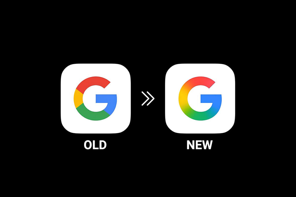
The long-anticipated Google G logo update is here, marking the tech giant’s first significant logo redesign in nearly 10 years. The changes are subtle, but this update shows Google’s shift toward AI, personalization, and a modern design style.
A Quick History of the Google G Logo
Google’s last major branding update was on September 1, 2015. That update introduced a cleaner typeface called Product Sans. At the same time, Google launched its now-familiar G logo—a circular icon with solid red, blue, green, and yellow sections.
For nearly a decade, this logo has been used across Google Search, Chrome, Maps, and many other apps. But now, Google has begun rolling out a fresh visual change.
What’s New in the Google G Logo Update?
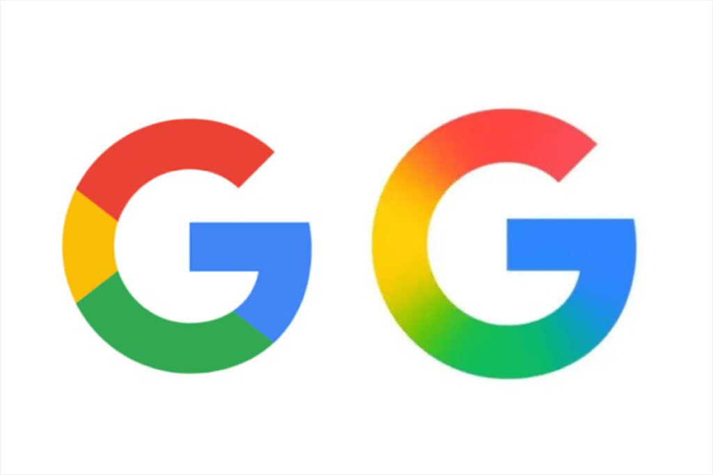
The updated ‘G’ logo keeps Google’s four traditional colors—blue, red, yellow, and green—but moves away from segmented color blocks. Instead, the colors now bleed seamlessly into one another in a continuous gradient. Red flows into yellow, yellow into green, and green into blue. The result is a more vibrant, modern appearance that feels both dynamic and more natural.

This design shift is more than aesthetic. It aligns with Google’s evolving identity in an age where artificial intelligence and adaptive interfaces are at the forefront. The gradient style is consistent with the branding of Gemini, Google’s AI assistant, and is seen in features like “AI Mode” in Search, which uses similar visual cues.
Where You’ll See It First
The new icon quietly rolled out on iOS with the latest update to the Google Search app. Android users began seeing it with Google App version 16.18 (beta) earlier this week. For most users, the difference may go unnoticed—especially when the icon appears as a tiny favicon in a browser tab or on a crowded home screen. But this subtle evolution may be a sign of bigger visual changes to come.
A Preview of What’s Ahead?
So far, Google hasn’t updated its full six-letter logo. There’s also no confirmation that icons like Chrome, Maps, Gmail, or Drive will change. However, the four-color branding used in many of these apps makes them strong candidates for future updates. A unified, gradient-driven aesthetic across Google’s ecosystem would signal a more tightly integrated design language, especially as AI features become deeply embedded across services.
Why This Matters
On the surface, a logo tweak might seem minor. But Google’s brand identity is one of the most recognizable in the world. Even subtle updates send a message—about innovation, adaptability, and alignment with modern trends. In this case, the move towards gradients and more expressive visuals suggests a deeper focus on personalization, emotion, and the human aspect of technology.
As Google positions itself as a leader in AI and user-centric design, even a small change like this helps build the narrative: Google is evolving, and it wants you to see and feel that evolution in every interaction—starting with its icon.
Final Thoughts
The updated ‘G’ icon may be subtle, but it’s a clear sign that Google is preparing for the next phase of its journey. With AI becoming a core part of the user experience, and visual design becoming more fluid and expressive, this new look is more than just a fresh coat of paint—it’s a quiet announcement that change is here, and more is likely on the way.
Stay tuned as we track whether other parts of the Google ecosystem adopt this new visual language in the coming months.


